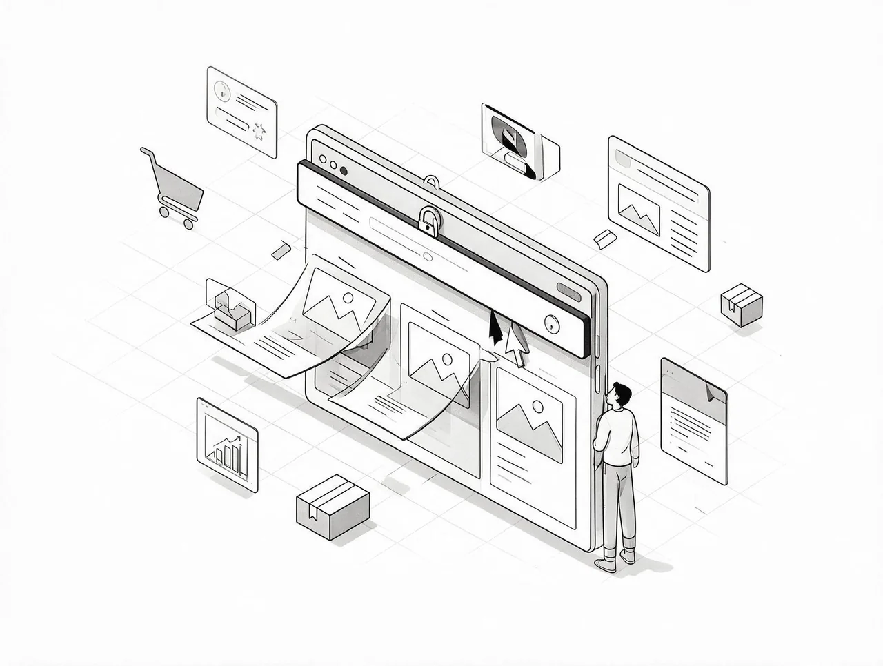
CSS position: sticky keeps navigation bars, banners, and buttons visible as shoppers scroll. The problem isn't whether to use it, it's that most stores make the wrong elements sticky and sacrifice the screen space that actually drives conversions. Every sticky element reduces viewport available for product images and copy, especially on mobile where your customers shop.
Screen Real Estate Is a Zero-Sum Game
A sticky header consuming 15% of a mobile screen means product images appear 15% smaller and copy becomes harder to scan. This matters because you're not choosing between sticky elements and nothing, you're choosing between persistent UI and the content that convinces customers to buy. Most stores default to making everything important sticky: free shipping banner, navigation, add-to-cart button, announcement bar. This approach treats visibility as inherently valuable without accounting for the cost.
The decision framework is simpler than it appears. Sticky positioning should only apply to elements that reduce friction for high-intent actions. A sticky add-to-cart button on a product page keeps the primary conversion action available when a customer scrolls through images to read reviews, a high-intent moment. A sticky announcement bar advertising a sale the customer saw five seconds ago creates no additional value and only consumes space.
Ask: does this element enable an action the customer wants to take right now, or does it broadcast information they've already received? If it's the latter, standard positioning works fine.
The Implementation Gap Is Structural, Not Technical
CSS position: sticky is straightforward to write. The problem is knowing where in your theme files to apply it and which selectors to target. Shopify themes vary widely. Some use section-based architecture where navigation lives in a standalone liquid file. Others embed navigation directly in theme.liquid. Your add-to-cart button might render through a product-template snippet or generate through a page builder app.
For founders doing $10K–$100K monthly, basic implementations are achievable without a developer. Identify the element you want sticky, inspect it to find its CSS class or ID, add position: sticky with appropriate top or bottom values to your theme's custom CSS. This works for simple elements like navigation or a single CTA button. You can implement it in 10 minutes and see immediate UX improvements.
More complex implementations, like a sticky add-to-cart that only appears after scrolling past the fold, require conditional logic outside pure CSS. This needs development resources but delivers measurably better conversion impact. The tradeoff is speed versus sophistication.
Conversion Impact Lives on Long-Scroll Pages
Sticky positioning doesn't create demand. It reduces friction between intent and action for customers already moving toward purchase. When a shopper scrolls through your product page, reads reviews, and decides to buy, a sticky add-to-cart button eliminates scrolling back up, a small friction point that disproportionately affects mobile users.
Conversion impact is highest on long-form pages where customers scroll significantly before deciding. Product pages with extensive descriptions, multiple image galleries, and review sections benefit most. Collection pages and homepages see less impact because scroll depth is lower and the primary action, clicking through to a product, already appears within each product card.
Start with product pages and the add-to-cart button. Measure impact on add-to-cart rate and conversion rate over two weeks. A 5-10% lift in add-to-cart rate justifies expanding to other high-scroll pages. No movement means the problem sits earlier in the funnel: product positioning, imagery, or offer clarity.
The mistake is implementing sticky elements without baseline metrics. You need current add-to-cart rate and conversion rate before making changes. Shopify's analytics dashboard provides these metrics. If you're running Google Analytics, set up event tracking on your add-to-cart button before implementation.
Mobile Requires Different Sticky Decisions Than Desktop
Desktop users scroll less, have more screen real estate, and can easily return to elements they need. Mobile users scroll more, have limited viewport space, and face higher friction when moving backward. Sticky positioning decisions must be mobile-first, even if desktop represents significant traffic.
Test sticky elements on mobile devices first. Consider using CSS media queries to apply sticky positioning only on mobile screens. A sticky navigation bar that works on desktop can feel oppressive on a 375px-wide iPhone screen where it consumes 20% of the viewport.
This changes which elements you make sticky. On mobile, a sticky add-to-cart button is high-value because scrolling back to the top is tedious. A sticky navigation bar is lower-value because mobile users expect to access it through a hamburger menu, not a persistent bar. On desktop, the inverse often holds, persistent navigation is expected, while a sticky add-to-cart button matters less because scrolling is easier.
Map your customer journey on mobile separately from desktop. Identify the highest-friction moments in each. Apply sticky positioning only where it removes meaningful friction. Blanket implementations that treat all devices identically miss the opportunity to optimize for how customers actually behave on each platform.